
Quick warning – there are a lot of charts in this blog. I think they are well worth looking at though. I have seen a few articles comparing the rally since the March 2020 lows to the rally in 2009, and the two do look similar. Today, we are going to look at different time periods though. A recent piece from Bespoke compares the last 6-months to other 6-month rallies in the past. The results are pretty fascinating – take a look. Here are charts of 5 different periods since WWII with an overlay of the last 6-months in S&P 500 returns. The current rally is in gray and previous time periods in blue. Notice the similarities (they do not just look similar; they all have a correlation coefficient of 0.94 or higher)?
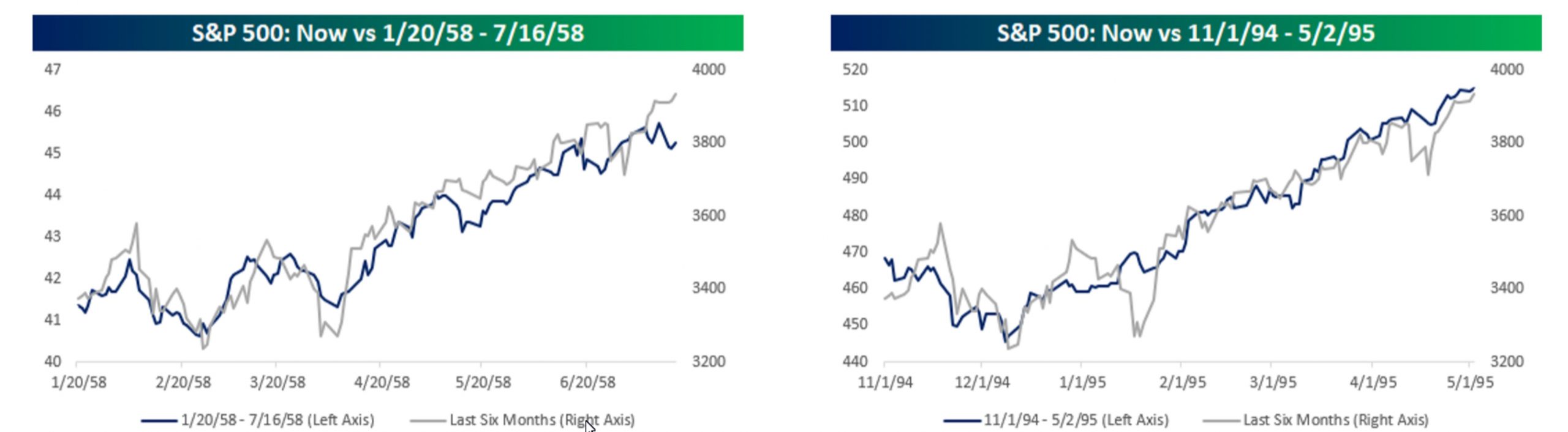
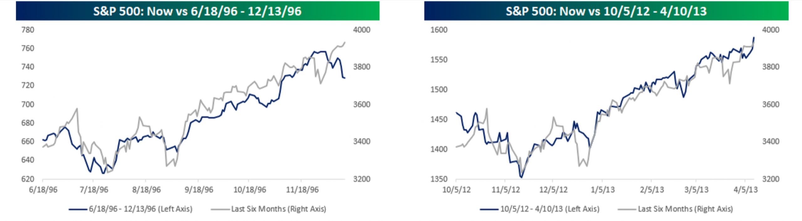
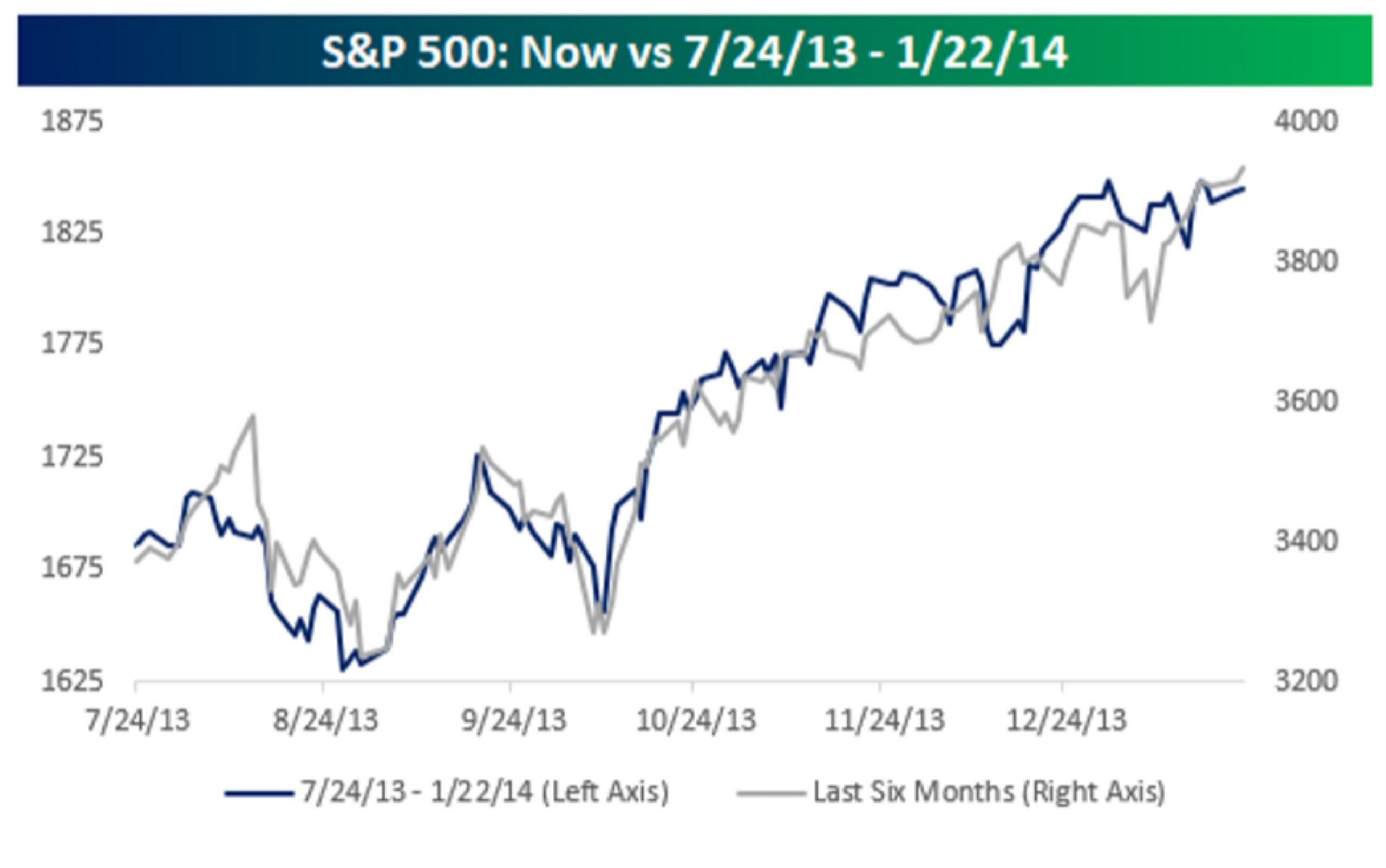
Before I state the next part, let me reiterate the typical investment disclosure: past performance isn’t indicative of future results. During the five previous rallies above, the average 1-year return was 22.9% with a median return of 25%. We can revisit a year from now to see how this one turns out.
Source: Bespoke